JavaScript Examples Part 1 for solving requirements with the Frontend Web Assets
Note: These features are part of the Visforms Subscription and are not included in the free Visforms version.
Calculate and display the cross sum of a number field
Subjects
The following topics are covered in the example:
- Executing code only after the form has been initialized by Visforms.
- Responding to user-initiated changes.
- Retrieving numerical values from number fields.
- Targeting specific fields using their field ID.
- Outputting text to a text field.
Description
A form has, among other things, a number field and a text field. The text field has the Read-Only setting. If the user changes the value of the number field, the cross-sum should be recalculated and displayed in this text field in the form.
The form
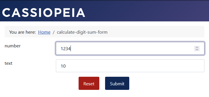
The form configuration
The form configuration
The JavaScript code is entered into the JavaScript option field within the form configuration—specifically under the Frontend Webassets tab and the Form sub-tab:
- Form configuration » Tab: Frontend Webassets » Sub-tab: Form
Parameter: JavaScript = The JavaScript code.
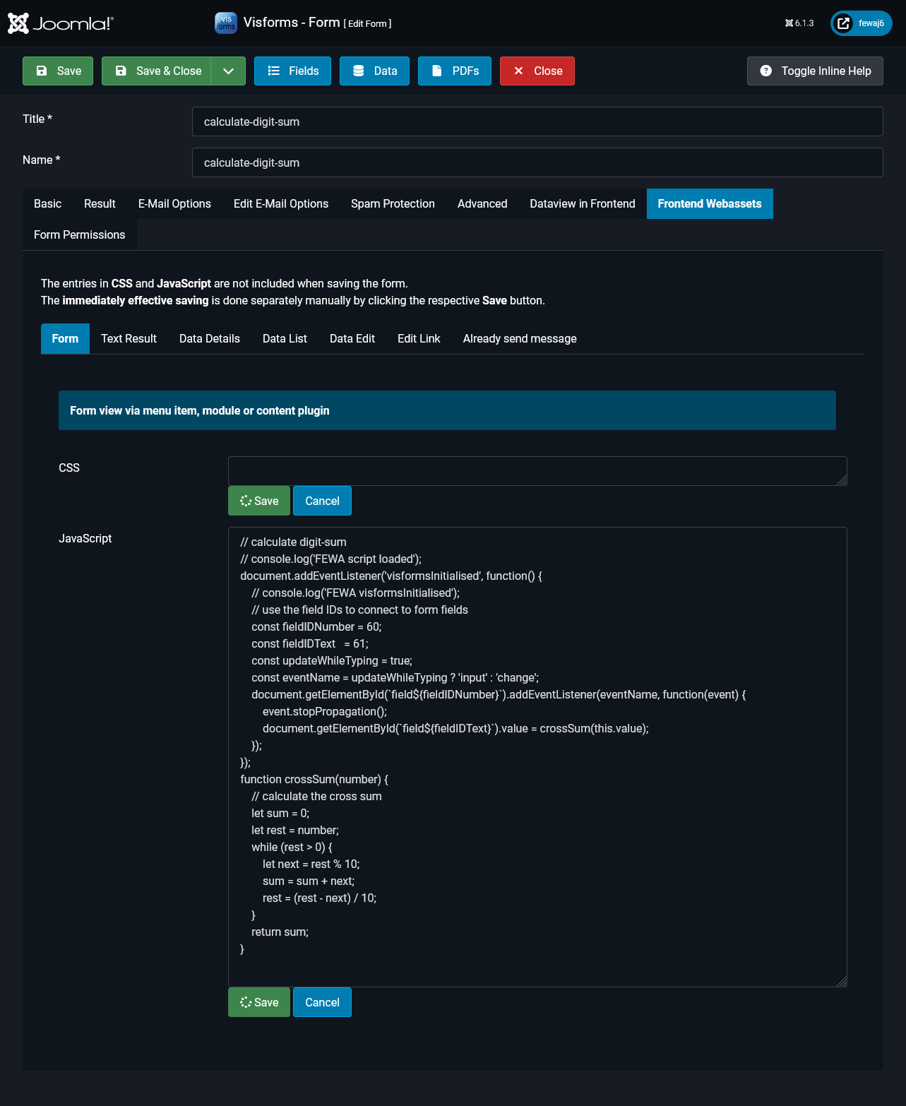
The JavaScript code
// calculate digit-sum
// console.log('FEWA script loaded');
document.addEventListener('visformsInitialised', function() {
    // console.log('FEWA visformsInitialised');
    // use the field IDs to connect to form fields
    const fieldIDNumber = 60;
    const fieldIDText   = 61;
    const updateWhileTyping = true;
    const eventName = updateWhileTyping ? 'input' : 'change';
    document.getElementById(`field${fieldIDNumber}`).addEventListener(eventName, function(event) {
        event.stopPropagation();
        document.getElementById(`field${fieldIDText}`).value = crossSum(this.value);
    });
});
function crossSum(number) {
    // calculate the cross sum
    let sum = 0;
    let rest = number;
    while (rest > 0) {
        let next = rest % 10;
        sum = sum + next;
        rest = (rest - next) / 10;
    }
    return sum;
}
The ‘input’ and ‘change’ events
The code contains the following line:
const updateWhileTyping = true;
This boolean constant determines which of the two events—input or change—is used:
- The input event fires whenever a key is pressed while the input element has focus.
The field displaying the digit sum is updated with every digit entered. - The change event fires as soon as the input element loses focus.
The field displaying the digit sum is updated only when the user leaves the input field.
Conditional fields with logical AND
Subjects
The following topics are included in the example:
- Only run code after the form has been initialized by Visforms.
- Respond to user changes.
- Address affected fields using their field ID.
- Address radio fields by name.
- Control the display of fields.
Description
The ability to link conditional fields with a logical AND does not exist in Visforms as a simple configuration. In principle, this requirement can be easily implemented with some custom JavaScript code.
Any other scenarios, including significantly more complex logical conditions, can be implemented in the same way.
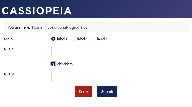
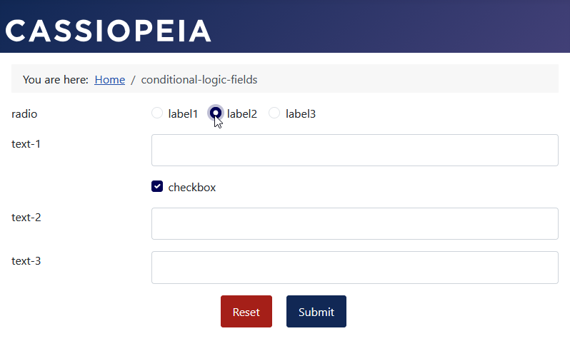
Below is an example of a logical AND between a check box and a radio button:
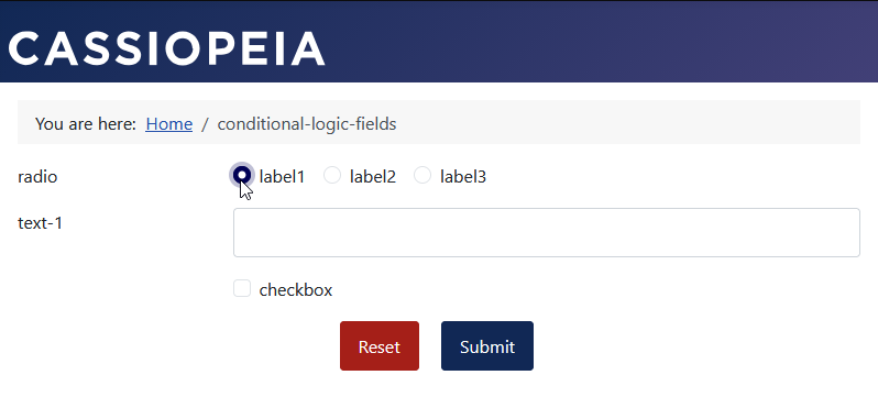
- Text field 'text-1' is configured as a conditional field of 'radio-1' for the option values label1 and label2.

- Text field 'text-2' is configured as a conditional field of 'checkbox-1'.

- Text field 'text-3' is controlled solely by the JavaScript code.
- Text field 'text-3' is only displayed if the radio field and checkbox field have the “correct” settings.
Hinweis: If text field 'text-3' is hidden, no data for the field will be transferred when the form is submitted.
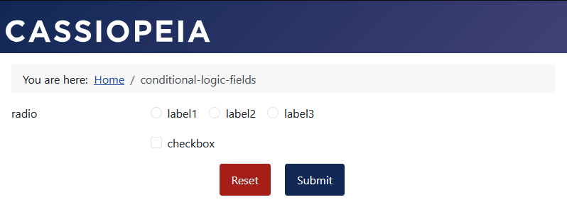
Form with no selection
Form with first selection
Form with second selection
Form with third selection
Form configuration
The JavaScript code is inserted in the form configuration, “Frontend Webassets” tab. Since this is the form display, you have to use the “Form” tab there. Enter the JavaScript code in the “JavaScript” field.
The JavaScript code
const idForm     = 9;
const radioName  = 'radio';
const radioValue = 'value2';
const idCheckbox = 66;
const idText3    = 68;
// console.log('FEWA script loaded');
document.addEventListener('visformsInitialised', function() {
    // console.log('FEWA visformsInitialised');
    handleChanged();
    document.querySelectorAll(`input[type=radio][name="form${idForm}${radioName}"], #field${idCheckbox}`).forEach(
        function() {
            this.addEventListener('change', function() {
                handleChanged();
            });
        }
    );
});
function handleChanged() {
    let checkbox = document.getElementById(`field${idCheckbox}`).checked;
    // notice the '?' sign: if you aren't sure the element exists, use optional chaining
    let radio = document.querySelector(`input[name="form${idForm}${radioName}"]:checked`)?.value;
    if(checkbox && radio === radioValue) {
        // show
        document.querySelector(`.field${idText3}`).style.display = '';
        document.querySelector(`#field${idText3}`).classList.remove('ignore');
        document.querySelector(`#field${idText3}`).disabled = false;
    }
    else {
        // hide
        document.querySelector(`.field${idText3}`).style.display = 'none';
        document.querySelector(`#field${idText3}`).classList.add('ignore');
        document.querySelector(`#field${idText3}`).disabled = true;
    }
}
Select time for text field
Subjects
The following topics are included in the example:
- Only run code after the form has been initialized by Visforms.
- Integration of a third-party JavaScript library.
- Bind form fields to a JavaScript library using their field IDs.
- Initialize form fields bound to a JavaScript library using that library.
- Implement a time window for the available selection for a bound form field.
Description
Visforms does not include a dedicated “Time” field type. Such a dedicated “Time” field would typically offer numerous options for configuring and precisely limiting the selectable times. It would also include various settings for time formats and similar parameters.
The same result can be achieved easily using a short, clear snippet of JavaScript code:
- A standard “Text” input field is used.
- The user is presented with a list of selectable times.
- All settings regarding selectable times or time formats are managed simply and directly within the JavaScript code.
Note: The third-party JavaScript library used can be configured to save space on mobile platforms with small screens.
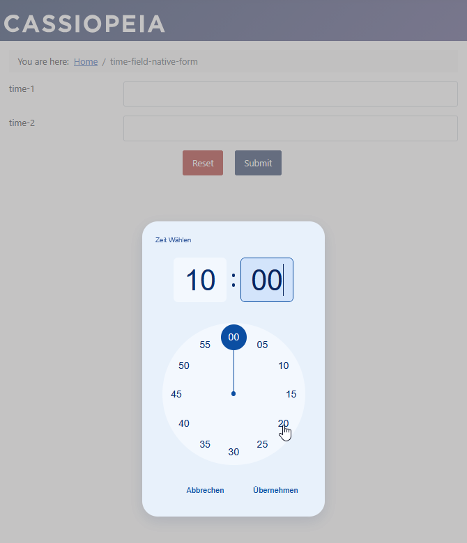
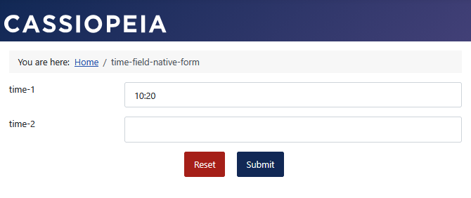
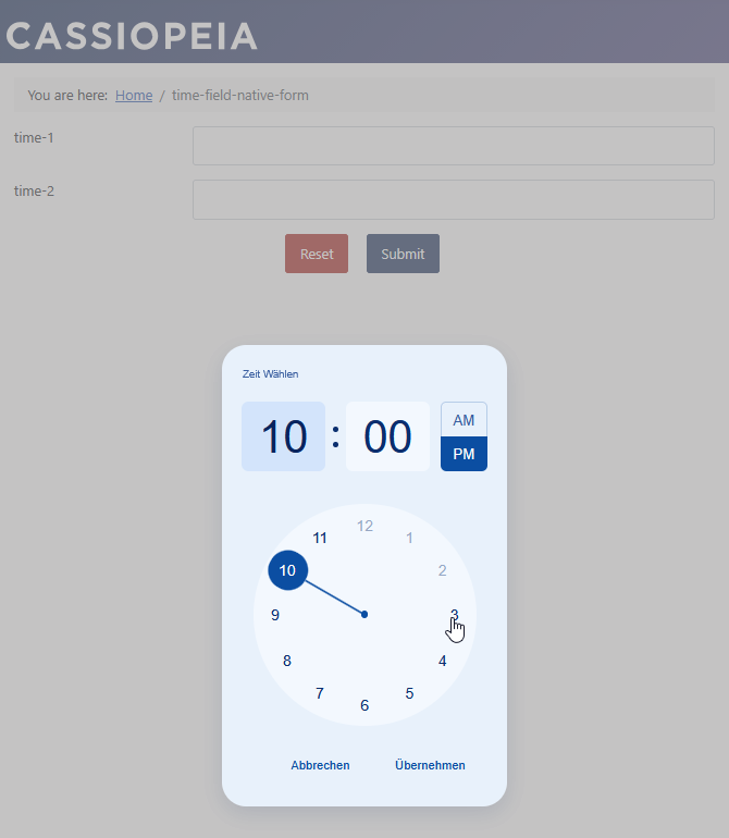
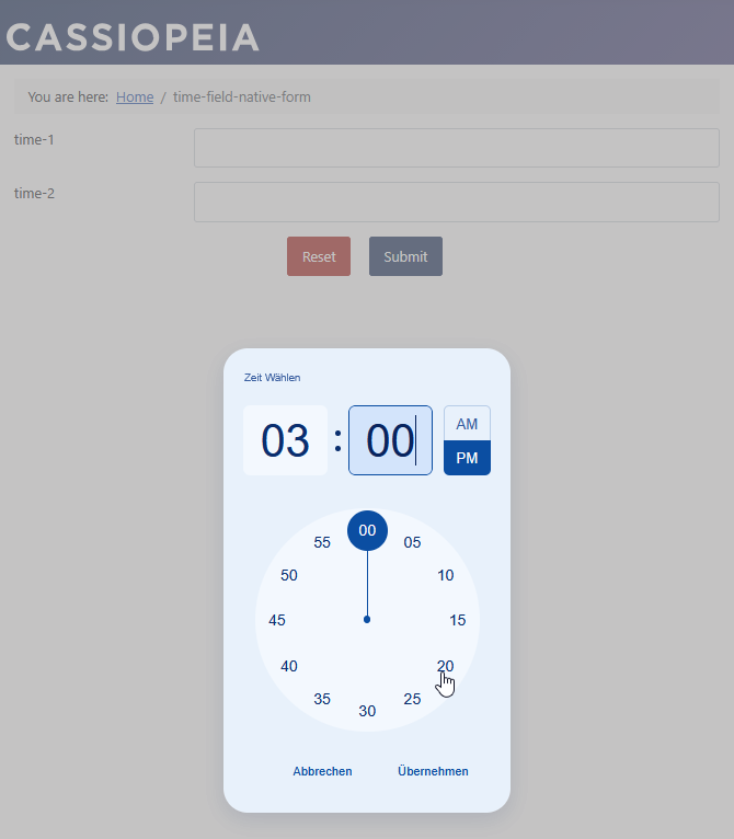
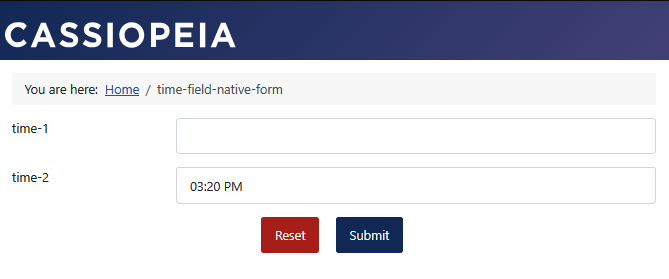
Form with time fields
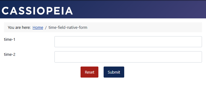
Field time-1 with “24-hour” format
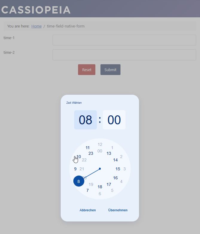
Field time-2 with “12-hour” format
The CSS Rule
The following small CSS rule is necessary for the Bootstrap 5-based Joomla template Cassiopeia.
/* Fix timepicker-ui clear button alignment layout conflict with Bootstrap 5 */
.tp-ui-wrapper, .tp-ui-wrapper.mobile {
    width: auto !important;
}
The JavaScript code
Based on the values set in the JavaScript code, the selection of available times is displayed:
- using the preset times defined by clock:disabledTime,
- in the specified time format clock:type,
- excluding the disabled times defined by clock:currentTime:time,
// console.log('FEWA script loaded');
document.addEventListener('visformsInitialised', function() {
    // console.log('FEWA visformsInitialised');
    initializeTimerUI24();
    initializeTimerUI12();
});

function initializeTimerUI24() {
    const fieldID1 = 79;
    const input = document.getElementById(`field${fieldID1}`);
    const options = {
        clock: {
            type: '24h',
            disabledTime: {
                interval: ['00:00 - 7:00', '12:00 - 13:00', '19:00 - 23:00']
            },
            currentTime: {
                time: new Date().setHours(8, 0, 0),
            }
        },
        ui: {
            theme: 'blueprint',
            clearButton: true,
            mobile: false
        },
        labels: {
            ok: 'Übernehmen', cancel: 'Abbrechen', clear:'Löschen', time: 'Zeit Wählen',
            mobileTime: 'Zeit eingeben', mobileHour: 'Stunde', mobileMinute: 'Minute'
        },
        callbacks: {
            onConfirm: (data) => console.log('selected: ', data),
        },
    };
    const picker = new TimepickerUI(input, options);
    picker.create();
}

function initializeTimerUI12() {
    const fieldID1 = 80;
    const input = document.getElementById(`field${fieldID1}`);
    const options = {
        clock: {
            type: '12h',
            disabledTime: {
                interval: "10:30 AM - 3:00 PM"
            },
            currentTime: {
                time: new Date().setHours(10, 0, 0),
            }
        },
        ui: {
            theme: 'blueprint',
            clearButton: true,
            mobile: false
        },
        labels: {
            ok: 'Übernehmen', cancel: 'Abbrechen', clear:'Löschen', time: 'Zeit Wählen',
            mobileTime: 'Zeit eingeben', mobileHour: 'Stunde', mobileMinute: 'Minute'
        },
        callbacks: {
            onConfirm: (data) => console.log('selected: ', data),
        },
    };
    const picker = new TimepickerUI(input, options);
    picker.create();
}
The JavaScript library used
JavaScript library
The example uses the popular library timepicker-ui:
Integration with direct loading via PHP
In Joomla 6, the management of stylesheets and scripts is handled exclusively via the Web Asset Manager. Joomla 6 requires declarative registration for custom extensions or templates. This allows the CMS to know exactly the order in which files must be loaded.
There are several ways to use the Web Asset Manager.
Below is a simple method involving direct loading via PHP, without using a JSON file.
Unlike other methods, this approach does not use the central joomla.asset.json file.
The joomla.asset.json file
- is located in your template’s root directory or your extension’s media folder,
- is used for the declarative registration of stylesheets and scripts.
The three components of the library were manually downloaded to the Joomla directory media/vendor/timepicker-ui/.
$wa = $this->getDocument()->getWebAssetManager();
// from https://cdn.jsdelivr.net/npm/timepicker-ui@4.4.0/dist/css/main.css
// from https://cdn.jsdelivr.net/npm/timepicker-ui@4.4.0/dist/css/index.css
// from https://cdn.jsdelivr.net/npm/timepicker-ui@4.4.0/dist/index.umd.js
$wa->registerAndUseStyle('main.min.css', 'media/vendor/timepicker-ui/main.min.css');
$wa->registerAndUseStyle('index.min.css', 'media/vendor/timepicker-ui/index.min.css');
$wa->registerAndUseScript('index.umd.js', 'media/vendor/timepicker-ui/index.umd.js', [], ['defer' => true]);
Using a Visforms Custom Plugin
The necessary PHP code to load the third-party JavaScript library directly can be implemented, for example, via a Visforms Custom Plugin.
The plugin must be enabled in the Joomla Plugin Manager in order to be used.
Below is the PHP code for the Visforms Custom Plugin used to load the JavaScript library before the form is displayed.
Note: The JavaScript library is loaded by the following PHP code only when the form is displayed via a menu item, and exclusively for the form named time-field-native. Alternatively, the form ID can be used in the if-statement.
public function onVisformsFormPrepare(VisformsFormPrepareEvent $event): void {
    // context = 'com_visforms.form'
    // context = 'mod_visforms.form'
    // context = 'plg_vfformview.form'
    // the event is form-based and is fired once for the form
    // triggered almost immediately before the layout file (component/module/plugin) is loaded

    $context = $event->getContext();
    $form = $event->getForm();

    if($context === 'com_visforms.form' && $form->name === 'time-field-native') {
        $wa = Factory::getApplication()->getDocument()->getWebAssetManager();
        $wa->registerAndUseStyle('main.min.css', 'media/vendor/timepicker-ui/main.min.css');
        $wa->registerAndUseStyle('index.min.css', 'media/vendor/timepicker-ui/index.min.css');
        $wa->registerAndUseScript('index.umd.js', 'media/vendor/timepicker-ui/index.umd.js', [], ['defer' => true]);
    }
}
The following adjustments to your situation are necessary:
- $form->name === ‘time-field-native' The Visforms form name from the form configuration.
Selecting a time for a text field with an offset
Topics
The following topics are covered in the example:
- Executing code only after the form has been initialized by Visforms.
- Integrating a third-party JavaScript library.
- Binding form fields to a JavaScript library using their field IDs.
- Initializing form fields bound to a JavaScript library using that library.
- Implementing a selectable time window for a bound form field.
- Accounting for a time offset when the current date is selected.
Description
This is an extension of the previous example above to select a time for a text field.
In addition to selecting the possible times, the selection is further restricted:
The first selectable time for the current day should be 3 hours in the future.
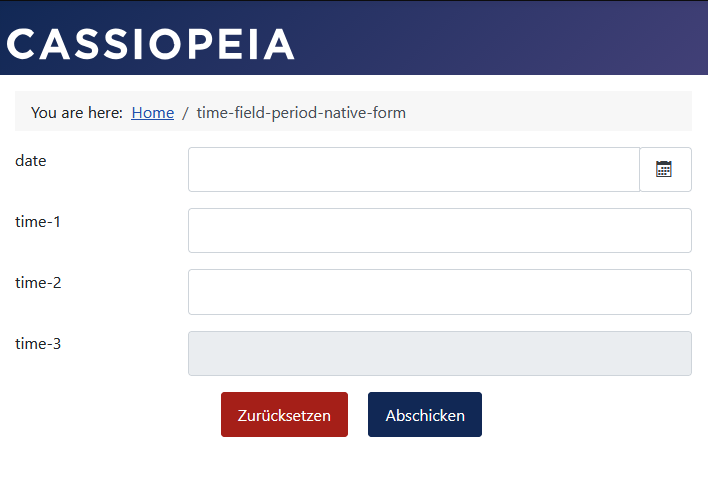
Date selection is incorporated into the solution:
- The form starts with the time field disabled.
- The time field becomes available for input only after a date has been selected.
- If the date is changed, any input previously entered in the time field is reset.
The current day requires special handling, as an additional lead time of OFFSET_HOURS hours must be applied. For all other days, the time limits are determined solely by the configuration of the start time BUSINESS_OPEN and end time BUSINESS_CLOSE.
Field time-3 with a 3-hour offset
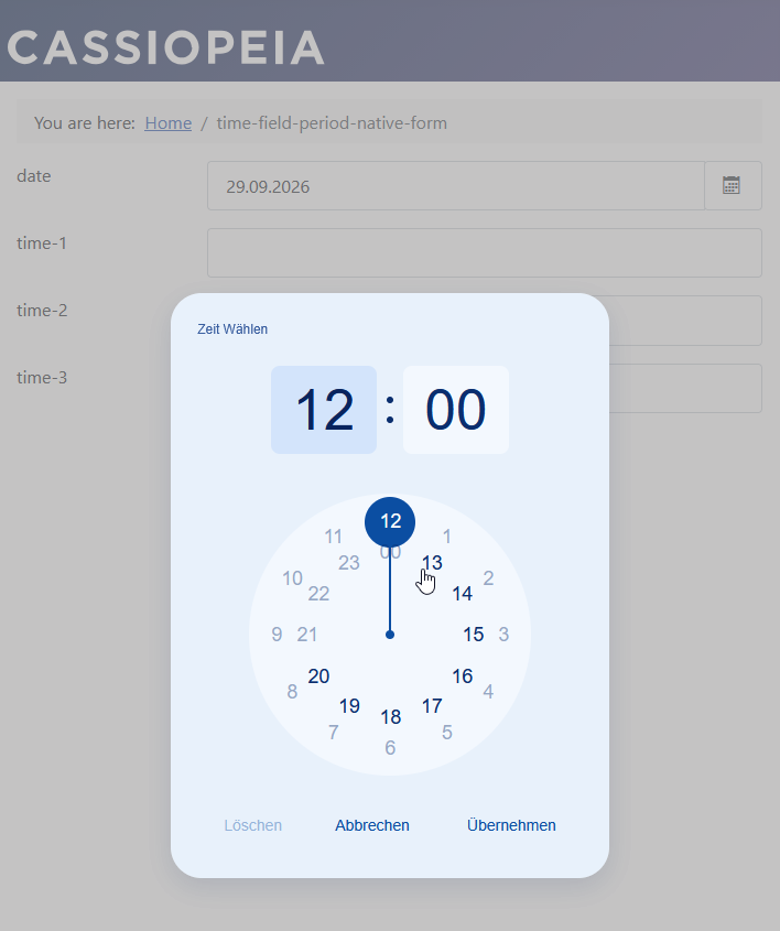
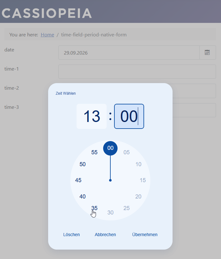
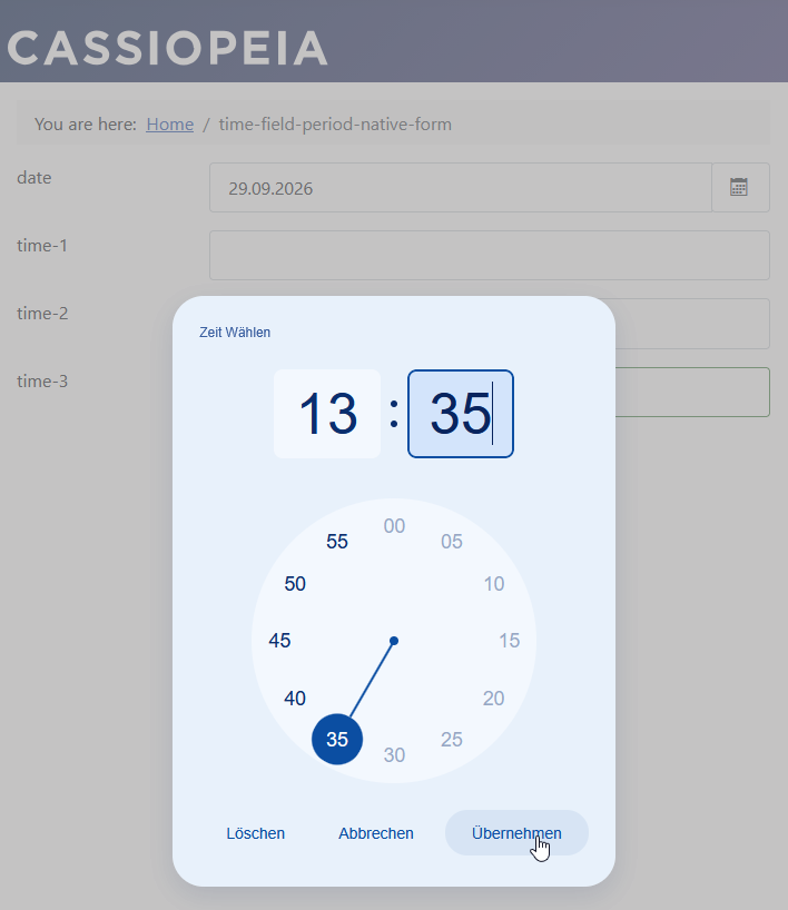
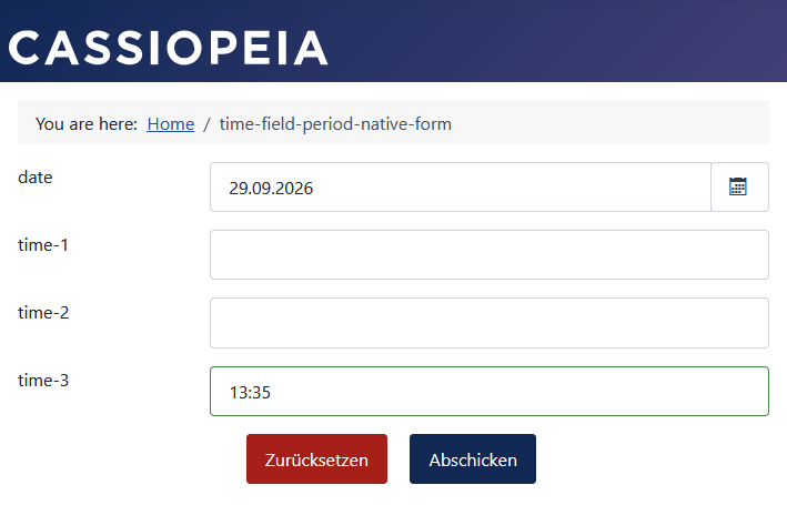
The time selection for this example was made at 10:32 AM.
The earliest selectable time for the same day is therefore 1:35 PM.
For all other days, the entire daily business opening period is selectable.
Start of the form
Today selected as the date
The earliest selectable time for the same day is 1:35 PM.
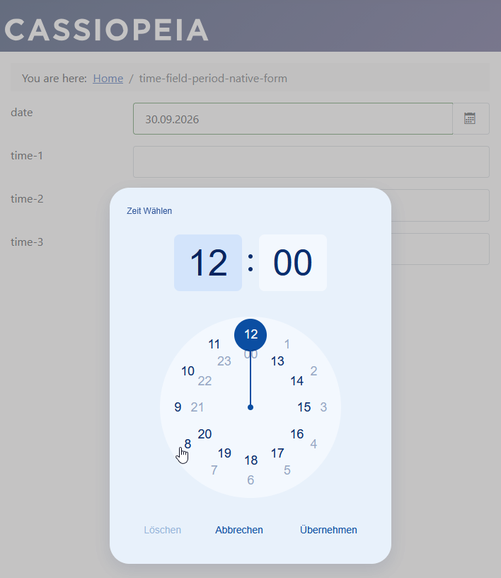
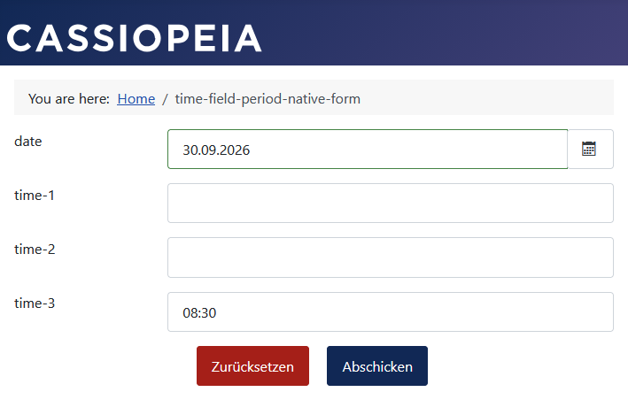
Tomorrow selected as the date
For all other days, the entire daily business opening period can be selected.
The CSS Rule
The following small CSS rule is necessary for the Bootstrap 5-based Joomla template Cassiopeia.
/* Fix timepicker-ui clear button alignment layout conflict with Bootstrap 5 */
.tp-ui-wrapper, .tp-ui-wrapper.mobile {
    width: auto !important;
}
The JavaScript Code
Based on the values set in the JavaScript code, filtered times are displayed for selection.
// console.log('FEWA script loaded');
const dateID = 92; // Visforms date field ID of field list
const textID = 95; // Visforms time edit field ID of field list
const OFFSET_HOURS   = 3;
const BUSINESS_OPEN  = '08:00';
const BUSINESS_CLOSE = '21:00';
let picker;
let options;
document.addEventListener('visformsInitialised', function() {
    // console.log('FEWA visformsInitialised');
    document.getElementById(`field${textID}`).disabled = true;
    document.getElementById(`field${dateID}`).addEventListener('change', function(event) {
        event.stopPropagation();
        document.getElementById(`field${textID}`).value = '';
        document.getElementById(`field${textID}`).disabled = false;
        initializeTimerUI();
    });
});

function initializeTimerUI() {
    if(picker !== undefined) {
        picker.destroy();
    }
    const input = document.getElementById(`field${textID}`);
    options = {
        clock: {
            type: '24h',
            disabledTime: {
                interval: getInterval(BUSINESS_OPEN, BUSINESS_CLOSE),
            }
        },
        ui: {
            theme: 'blueprint',
            clearButton: true,
            mobile: false
        },
        labels: {
            ok: 'Übernehmen', cancel: 'Abbrechen', clear:'Löschen', time: 'Zeit Wählen',
            mobileTime: 'Zeit eingeben', mobileHour: 'Stunde', mobileMinute: 'Minute'
        },
        callbacks: {
            onConfirm: (data) => {
                const selectedTime = `${data.hour}:${data.minutes}`;
                const intervalSetting = options.clock.disabledTime.interval;

                // Run the manual check against your configuration
                if (isTimeDisabled(selectedTime, intervalSetting)) {
                    alert("Diese Zeit ist nicht möglich - wählen Sie eine andere Zeit.");
                    input.value = ""; // Clear out the invalid data
                    // Optional: force the UI back open to pick a proper slot
                    setTimeout(() => picker.open(), 500);
                } else {
                    console.log("Success! Time accepted:", selectedTime);
                }
            }
        },
    };
    picker = new TimepickerUI(input, options);
    picker.create();
}

function getInterval(bizOpenStr, bizCloseStr) {
    const selected = document.getElementById(`field${dateID}`).value;
    const d = new Date();
    const today = String(d.getDate()).padStart(2, '0') + '.'  + String(d.getMonth() + 1).padStart(2, '0') + '.'  + String(d.getFullYear());
    if(today === selected) {
        // today: handle the time offset
        console.log('handle the time offset');
        return getDynamicDisabledInterval(bizOpenStr, bizCloseStr);
    }
    else {
        // not today: regular opening hours
        console.log('regular opening hours');
        return [`00:00 - ${bizOpenStr}`, `${bizCloseStr} - 23:59`];
    }
}

function getDynamicDisabledInterval(bizOpenStr, bizCloseStr) {
    // Generates the precise interval string to pass to timepicker-ui
    const now = new Date();
    // 1. Calculate the rolling 2-hour delay threshold
    const delayTime = new Date(now.getTime() + OFFSET_HOURS * 60 * 60 * 1000);
    const delayHH = String(delayTime.getHours()).padStart(2, '0');
    const delayMM = String(delayTime.getMinutes()).padStart(2, '0');
    const delayStr = `${delayHH}:${delayMM}`;
    // 2. Determine when the doors "effectively" open today (the later of business open vs delay)
    const effectiveOpenStr = delayStr > bizOpenStr ? delayStr : bizOpenStr;
    // Edge Case: If the 2-hour delay pushes past closing time, block the entire day
    if (effectiveOpenStr >= bizCloseStr) {
        return ['00:00 - 23:59'];
    }
    // 3. Build intervals to blacklist (block before open, and block after close)
    // This explicitly leaves ONLY the window between effectiveOpenStr and bizCloseStr selectable.
    return [`00:00 - ${effectiveOpenStr}`, `${bizCloseStr} - 23:59`];
}

/**
 * Validates whether a given time string (e.g., "12:00") falls into the disabled intervals.
 * @param {string} timeString - The time to check ("HH:MM")
 * @param {string|string[]} intervals - The disabled interval(s) from options
 * @returns {boolean} - true if the time is disabled/forbidden, false if it is allowed
 */
function isTimeDisabled(timeString, intervals) {
    // Convert "HH:MM" into total minutes from midnight for direct numerical comparison
    const toMinutes = (t) => {
        const [h, m] = t.trim().split(":").map(Number);
        return h * 60 + m;
    };

    const target = toMinutes(timeString);
    // Ensure we are working with an array even if a single string interval was passed
    const intervalArray = Array.isArray(intervals) ? intervals : [intervals];

    // Check if the target minutes fall within ANY of the disabled time blocks
    return intervalArray.some(interval => {
        if (!interval) return false;
        const [start, end] = interval.split("-");
        return target >= toMinutes(start) && target <= toMinutes(end);
    });
}
The following adjustments to your situation are necessary:
- const dateID = 92 The Visforms date field ID from the field list.
- const textID = 95 The Visforms text field ID from the field list.
- const OFFSET_HOURS = 3 The offset in hours.
- const BUSINESS_OPEN = ‘08:00' The earliest selectable time of day.
- const BUSINESS_CLOSE = ‘21:00' The latest selectable time of day.
- alert(“Diese Zeit ist nicht möglich - wählen Sie eine andere Zeit.");
The notification text displayed if an invalid time is selected.
Inherent Design Characteristic of the Library
There is an inherent characteristic in the design of this otherwise excellent library.
If the associated text input field is completely empty when the dialog initializes, timepicker-ui automatically defaults to an internal value of 12:00 PM to display the analog clock hands.
This occurs before your disabledTime intervals are evaluated, creating a potential loophole:
A user can immediately click OK and submit the default time, even though that specific time is actually disabled.
To close this loophole, you must implement additional validation (a fallback check) to prevent submission.
To ensure that a user cannot bypass your validation—even if they somehow arrive at or enter an invalid time—you can utilize the built-in callback function.
By handling the onConfirm() event, you can manually verify the selection against your rules using the isTimeDisabled(timeString, intervals) function.
If the selection falls within a disabled time range, you can issue a warning, clear the input field, or reopen the time picker, effectively preventing the invalid data from being processed.
The helper function for custom validation reads the interval value directly from your configuration and returns true or false, depending on whether a specific time is disabled.
Note: This additional validation also provides protection in situations where the user leaves the time picker dialog open for an extended period without making a selection.
The JavaScript library used
JavaScript library
The example uses the popular timepicker-ui library:
Integration via direct loading with PHP
The integration of the timepicker-ui library is described in the previous example.
Progress display for multi-page forms with your own texts
Subjects
The following topics are included in the example:
- Only run code after the HTML document has been initialized.
- Detect HTML elements of the form.
- Added new text to HTML elements of the form.
Description
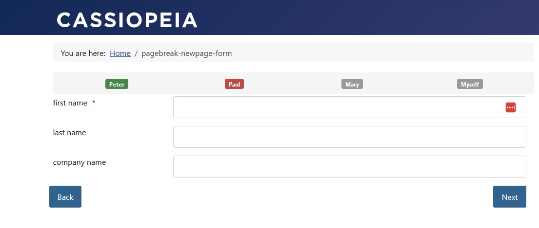
The progress display of the form should be provided with your own texts. Visforms has two options for displaying the progress of multi-page forms. The texts of the representation are numbered consecutively in both cases.
It is possible to give the individual step elements their own texts with very little JavaScript code.
The form
The form configuration
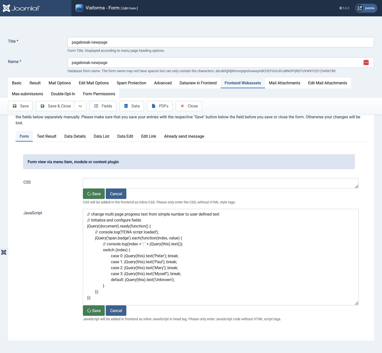
The JavaScript code
Note: The code uses the order of the individual pages in ascending direction. The first element has index 0.
// change multi page progress text from simple number to user defined text
// initialize and configure fields
jQuery(document).ready(function() {
    // console.log('FEWA script loaded');
    jQuery('span.badge').each(function(index, value) {
        // console.log(index + ': ' + jQuery(this).text());
        switch (index) {
            case 0: jQuery(this).text('Peter'); break;
            case 1: jQuery(this).text('Paul'); break;
            case 2: jQuery(this).text('Mary'); break;
            case 3: jQuery(this).text('Myself'); break;
            default: jQuery(this).text('Unknown');
        }
    });
});
Number of selected options for multiple selection
Subjects
The following topics are included in the example:
- Executing code only after the form has been initialized by Visforms.
- Respond to user changes.
- Determine the selected options of a multiple selection list box.
- Address affected fields using their field ID.
- Output to a text field of the form.
Description
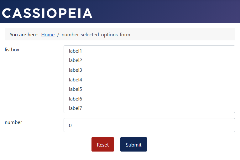
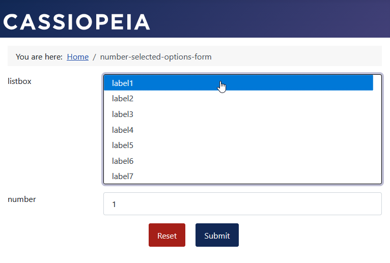
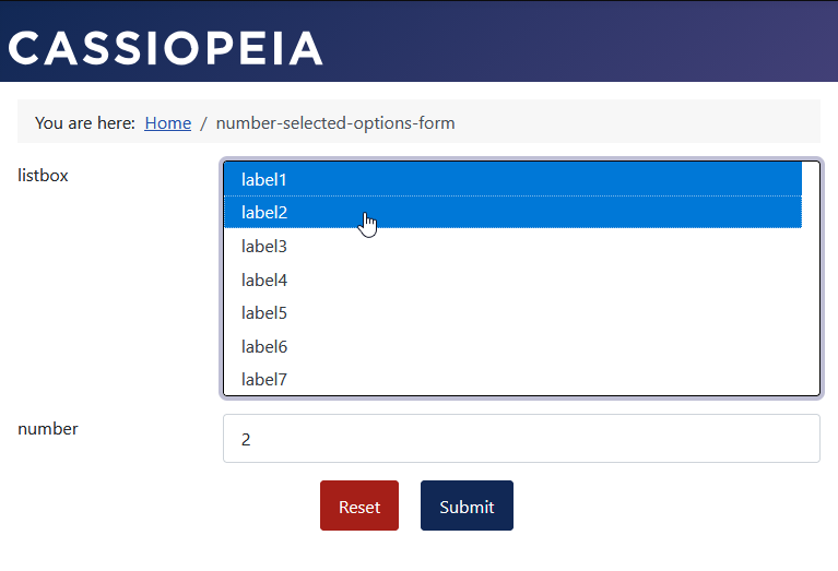
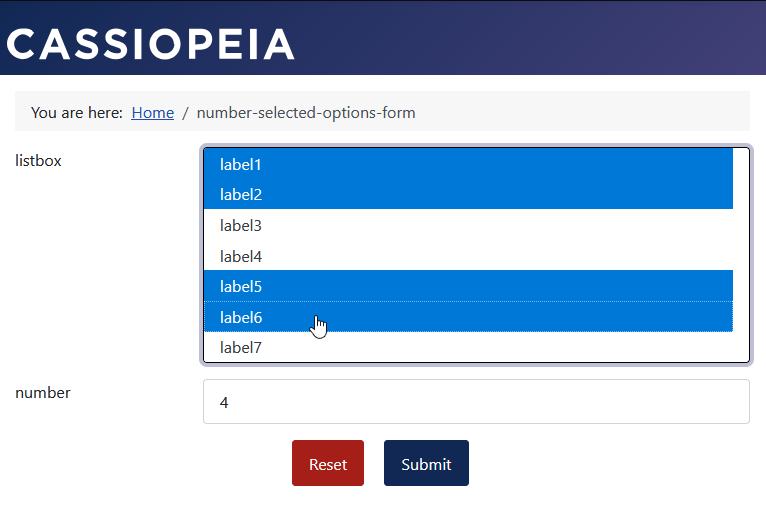
Determine the number of selected options in a multiple selection list box. Direct output of the number in a text field of the form.
The form
In the following form, more options are successively selected.
The number of options selected is immediately displayed in the text field.
However, you can also do anything different with the value.
The JavaScript code
// console.log('FEWA script loaded');
document.addEventListener('visformsInitialised', function() {
    // console.log('FEWA visformsInitialised');
    const selectID = 99;
    const textID   = 100;
    // initialize edit field with '0'
    document.getElementById(`field${textID}`).value = '0';
    // update on user selection changed
    document.getElementById(`field${selectID}`).addEventListener('change', function(event) {
        document.getElementById(`field${textID}`).value = document.querySelectorAll(`#field${selectID} :checked`).length;
    });
});
The following adjustments to your situation are necessary:
- const selectID = 99 The Visforms field ID from the field list of the multiple selection listbox.
- const textID = 100 The Visforms field ID from the field list of the text field for output.